Logo Usage
The logo is the essence of the NAB brand. The consistency of usage across all print and digital formats will ensure that the messaging remains cohesive to all audiences in all media.
The logo consists of type and a mark. It is used variously on its own, and/or with a descriptor.
The descriptor speaks directly to the mission of NAB and how we serve our members.
The following will provide basic guidelines for logo color and descriptor usage.
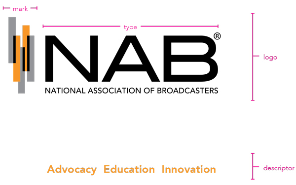
Logo Lockup
When using the logo lockup, it is important to retain the freespace standard that has been developed.
Certain branded items (mugs, shirts, etc.) may only use the letters “NAB” with the mark and not include the full association name. This usage should be limited to instances where familiarity with the organization is ensured – such as internal or member gift items.
Primary Logo
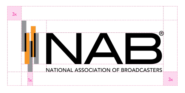
Secondary Logo
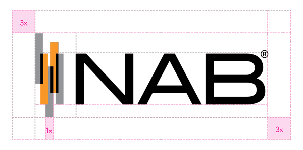
Logo Color Guide
The chart below displays the acceptable uses of color, ranked in order of preference.
1. The logo has the most impact when in color. Always strive to use this version.
2. In instances where a black or dark-colored background is required, use this version.
3. Use if a black or 1-color logo is requested by a vendor or publication. Also may be used on fax sheets.
4. Only used if a KO (knocked out) logo is requested by a vendor or publication.
Our logo is made of two colors, PMS 151 and Black. Depending on print and budget considerations, either a 50 percent Black or PMS Cool Grey 9 should be used. The Cool Grey adds a third color. It should always be used in large format or high-end applications (such as the annual report).
For 2-color Jobs
PANTONE®
151 C
C: 0
M: 48
Y: 95
K: 0
R: 248
G: 152
B: 40
#F89728
Black
C: 0
M: 0
Y: 0
K: 100
R: 0
G: 0
B: 0
#000000
Black 50%
C: 0
M: 1
Y: 0
K: 51
R: 145
G: 145
B: 148
#919194
For 3-color Jobs (Preferred)
PANTONE®
151 C
C: 0
M: 48
Y: 95
K: 0
R: 248
G: 152
B: 40
#F89728
Black
C: 0
M: 0
Y: 0
K: 100
R: 0
G: 0
B: 0
#000000
Pantone® Cool Grey 9
C: 0
M: 1
Y: 0
K: 51
R: 145
G: 145
B: 148
#919194
Logo Size
In order to retain the legibility, with the association name spelled out, the smallest the logo can appear in print is 1.25"x .5".
In some instances, where the logo must be very small, printing restrictions may require the omission of the association name. In this case, the trademark should be omitted as well.

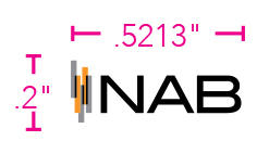
Logo Don'ts

Brand mark too large

Full association name is too small
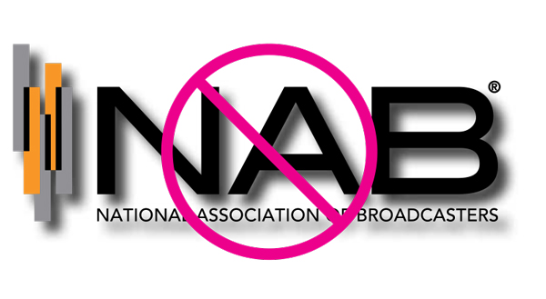
Do not use drop shadows or alter the logo in any way.
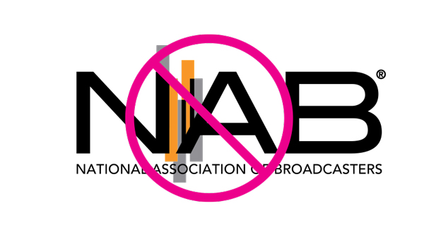
Do not run type over the bars, or use other graphic devices to alter the logo in any way.
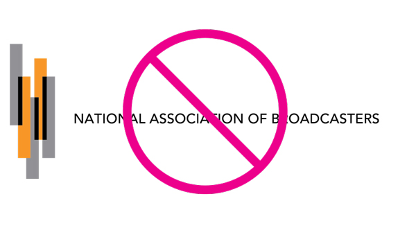
Do not use the name of the organization with the mark alone.

Do not use the name of the organization with the mark alone.
Logo Usage with Imagery
It is important to keep the logo clear and unobstructed when using it in conjunction with imagery. While placement may vary, proper contrast is vital for logo visibility. When possible, place logo over a white background.
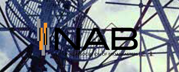
Not enough contrast. Background too busy.

Not enough contrast. Background colors too similar to logo.
Good contrast!
Wrong logo version.
Correct logo version!