NAB Show
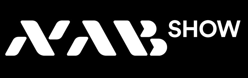
The NAB Show logo is a “sister” brand of the NAB. It incorporates the NAB type mark in a secondary typeface, using different colors and a different mark. The NAB Show logo mimics the NAB logo by using similarly sized bars that alternate between gray and a signature color as they do on the NAB mark. At the same time, the NAB Show logo’s bars are angled to portray motion and momentum; placed within the “A” as a nod to the heritage show logos of the past; and run slightly overtop the “B” to signify the breakthrough nature of the event’s solutions.
Event Names*:
NAB Show®
The 2026 NAB Show®®
- Do not use “The” before “NAB Show” in running copy when the event is a noun.
- “The” can be used when the year of the show is included.
Example: The 2026 NAB Show is in Las Vegas. - Do not use “NAB Show 2026”
- When NAB Show is an adjective “the” can precede it. Examples: The NAB Show logo should always be the first logo; The logo is the essence of the NAB Show brand.
When proofing for use of “the” and “NAB Show” do this test: Replace "NAB Show" with "Target."
- I am going to Target.
[Not] I am going to the Target.
[Correct use] I am going to NAB Show. - I like the Target holiday promotion.
[Not] I like Target holiday promotion.
[Correct use] I like the NAB Show holiday promotion.
NAB Show is registered and should use the appropriate symbol the first time it are mentioned in copy. Additionally, for direct mail or any piece that could often be read starting on the back cover or panel with a mailing address, the first NAB Show reference on the back cover/ panel should also use the appropriate symbol.
* Similar guidelines apply to NAB Show New York
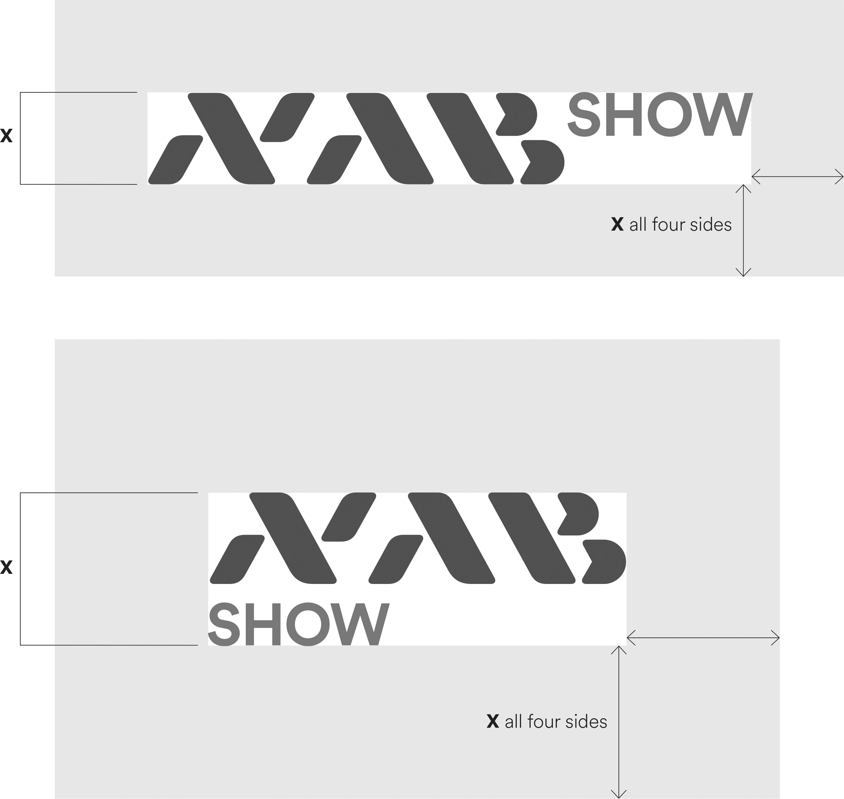
NAB Show Logo Lockup
The minimum allowable clear space helps properly stage the logo in relation to text, photos and surface/screen edges. The height of the logo at the size it is being used is X. This measurement is then used to establish the minimum clearance on all four sides. As a general rule, the more clear space the better.
NAB Show Logo Color Guide
The chart below displays the acceptable uses of color, ranked in order of preference.
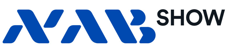
The logo has the most impact when in color. Always strive to use this version.
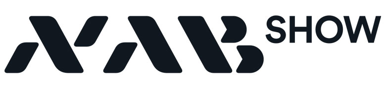
Use if a black or 1-color logo is requested by a vendor or publication. Also may be used on fax sheets.
Only used if a KO (knocked out) logo is requested by a vendor or publication.
The primary logo is made of two colors, Pantone Black 6C and Pantone 2728XGC. Depending on print and budget considerations, the PMS version should be used where possible. It should be used in large format or high-end applications. Otherwise, the CMYK version is an acceptable option.
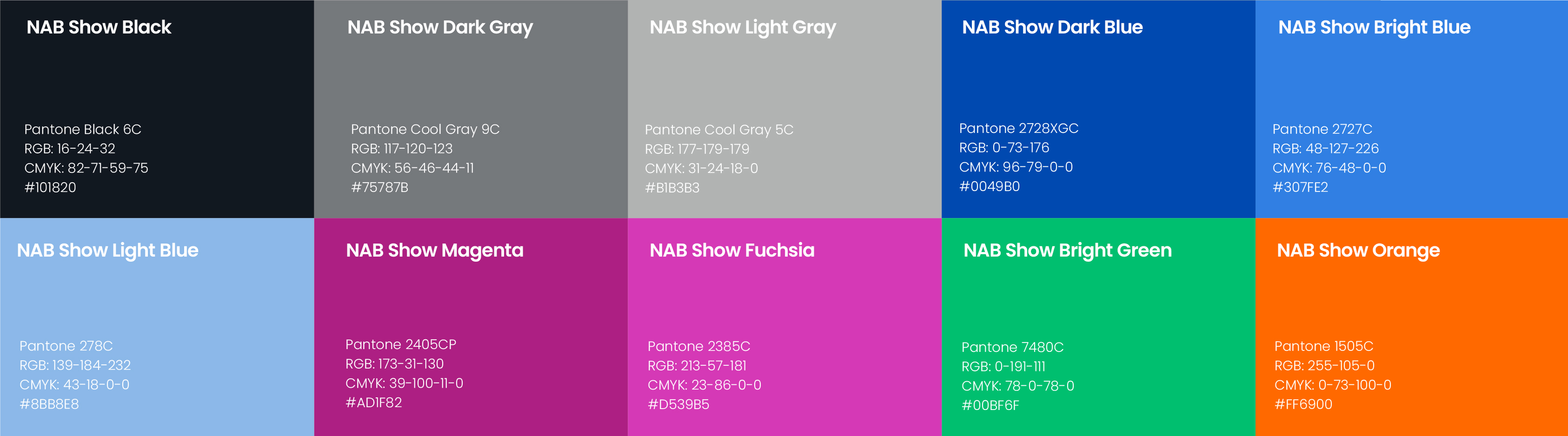
NAB Show Brand Colors